

Building a Design System
OVERVIEW
As Sticky by Tobii Pro continued to grow in both the number of clients and features, it became increasingly important to maintain a consistent style and visual language across all areas of the product. It was clear that we needed a more systematic way for our product to scale and for each team to work efficiently.
The initial outcome was to establish a collection of reusable components, that can be combined together to create both simple and complex experiences, as needed.
Lead Product Designer | Tobii Pro
Research, Information Architecture, Interaction, Visual Design, Testing, Support Documents & Videos.
Team of 1 designer & 4 developers
August 2016 - November 2016
THE PROBLEM
The number of Trello tickets were increasing at a rapid speed due to the stakeholder’s requests to scale and evolve the product. With a small team, it was clear that a new design language was needed to meet the tight delivery times for a consistent and intuitive platform.
BUSINESS GOAL: Reduce number of Trello tickets and increase efficiency of development team
THE SOLUTION
A Design System that was based on principles and best practices.
THE CHALLENGES
Planning and Priority without a product manager. Our team had to come up with a plan to toggle between working on pushing out new features and working on the new Design System.
Preparing clients for the changes they did not specifically request and would have to relearn. Even though changes would ultimately increase their efficiency, it was important to prepare clients to avoid initial shock.

Fig: Original vs updated dashboard with new design system in place

WHERE TO BEGIN…?
The first step was to map out the entire flow of the product and list all the components. This revealed many inconsistencies and were documented in Google Sheets. Examples include inconsistencies in nomenclature, colors, font sizes, and component groups. In addition, we went through existing support tickets and conversations with clients to learn more about their pain points.

LAYING DOWN A SOLID FOUNDATION
Google Material Design was my best friend. Instead of trying to recreate the wheel, we relied heavily on a system that was proven to be successful. In combination with principles of Atomic Design, we could confidently understand and define the layout, color, typography, icons, navigation, interactions, and information architecture.

PIECING IT ALL TOGETHER
All components were created and organized in one Sketch master file. The master file was uploaded into Invision using craft - allowing developers to use Inspect Mode in Invision to access all assets and source files. We soon discovered that our team’s productivity increased drastically and there was less back and forth questions regarding the UI elements. There was even an instance when a single developer quickly put together a feature just by referencing the framework from our library!

Fig: New user interface components
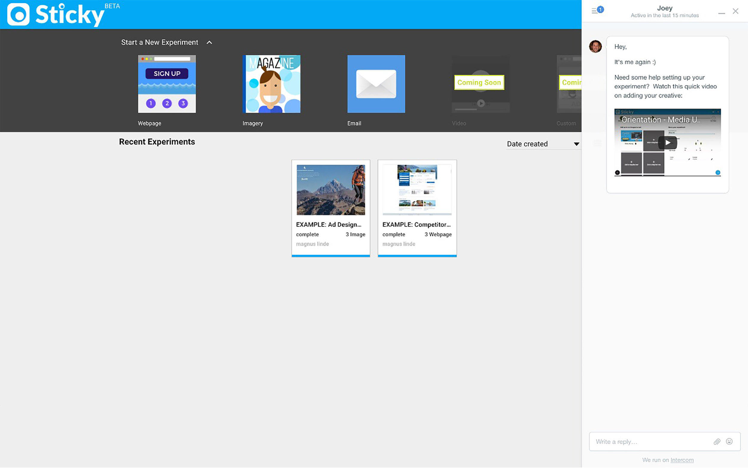
DASHBOARD - BEFORE
Starting a New Experiment wasn’t scaleable as we added experiment types. It also visually competed with the experiments that had been created.
Recent Experiments were small cards that had a short character allowance. Users had requested that these be larger so they could view more of the experiment names.
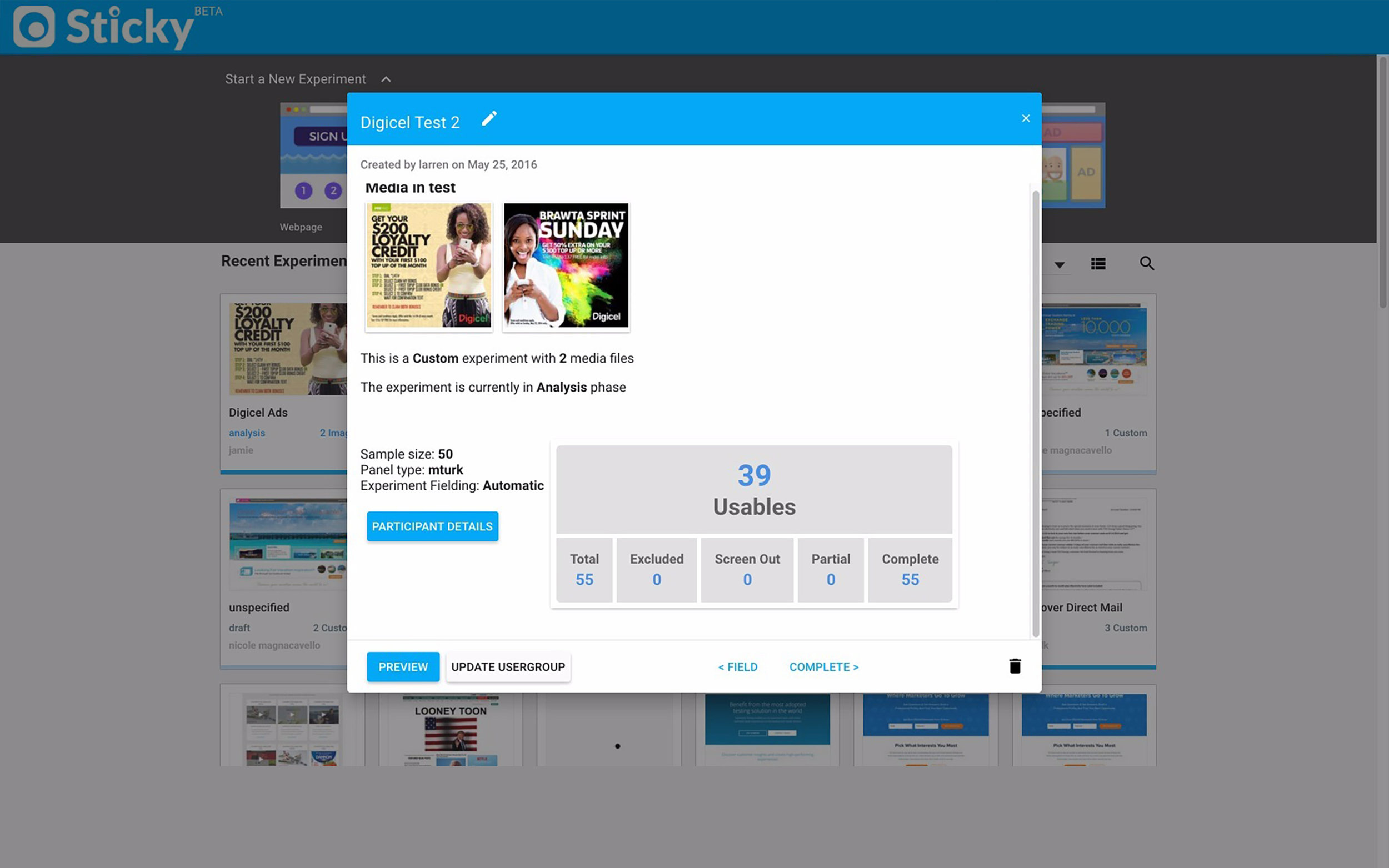
The Details Page (second slide) contained information that could be organized in a way that is more user friendly.
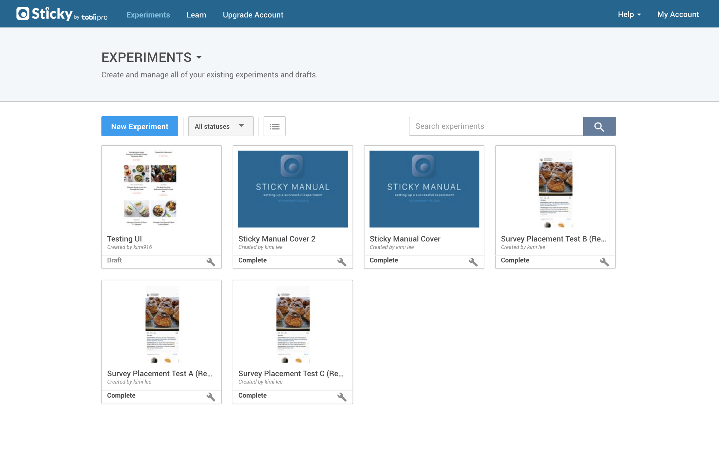
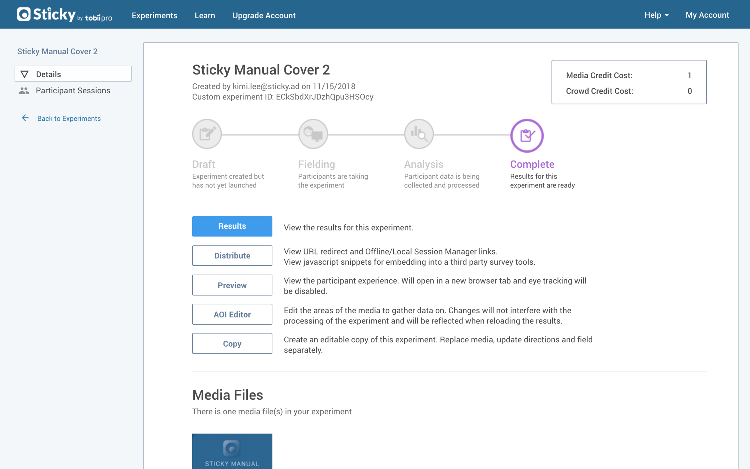
DASHBOARD - AFTER
Starting a New Experiment was now initiated via one CTA. Inspired by Google Drive, clicking on “New Experiment” would display a dropdown where the user can select from a list of experiment types. Ultimately, this proved to be the best solution as we now only support one type.
Recent Experiments now have a longer character allowance.
The Details Page (second slide) is organized by relevance (based on user feedback) and includes visualizations for users to easily recognize.
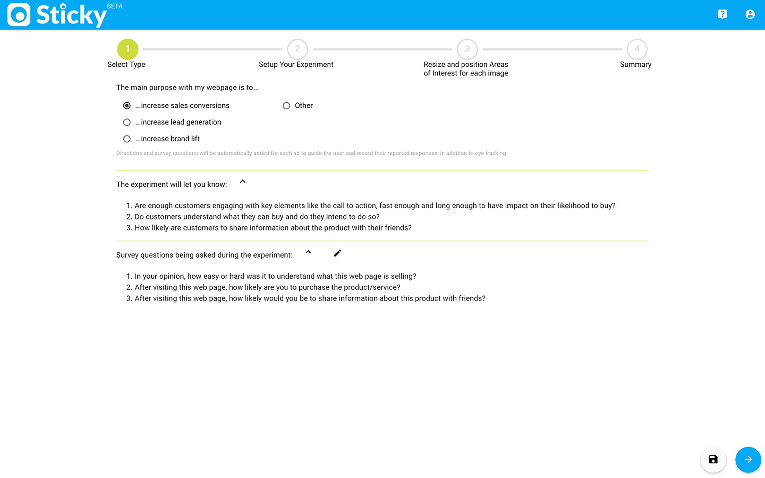
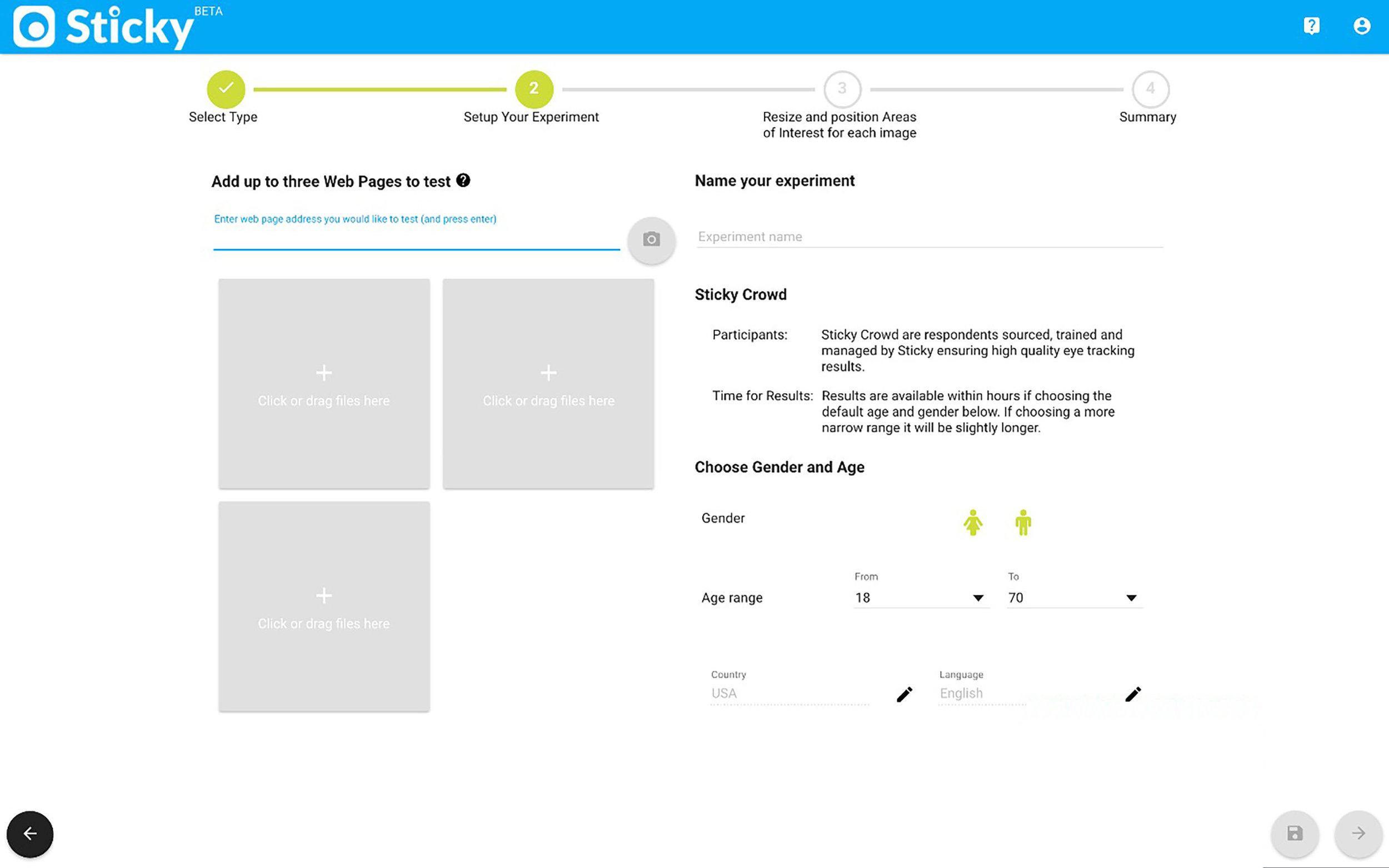
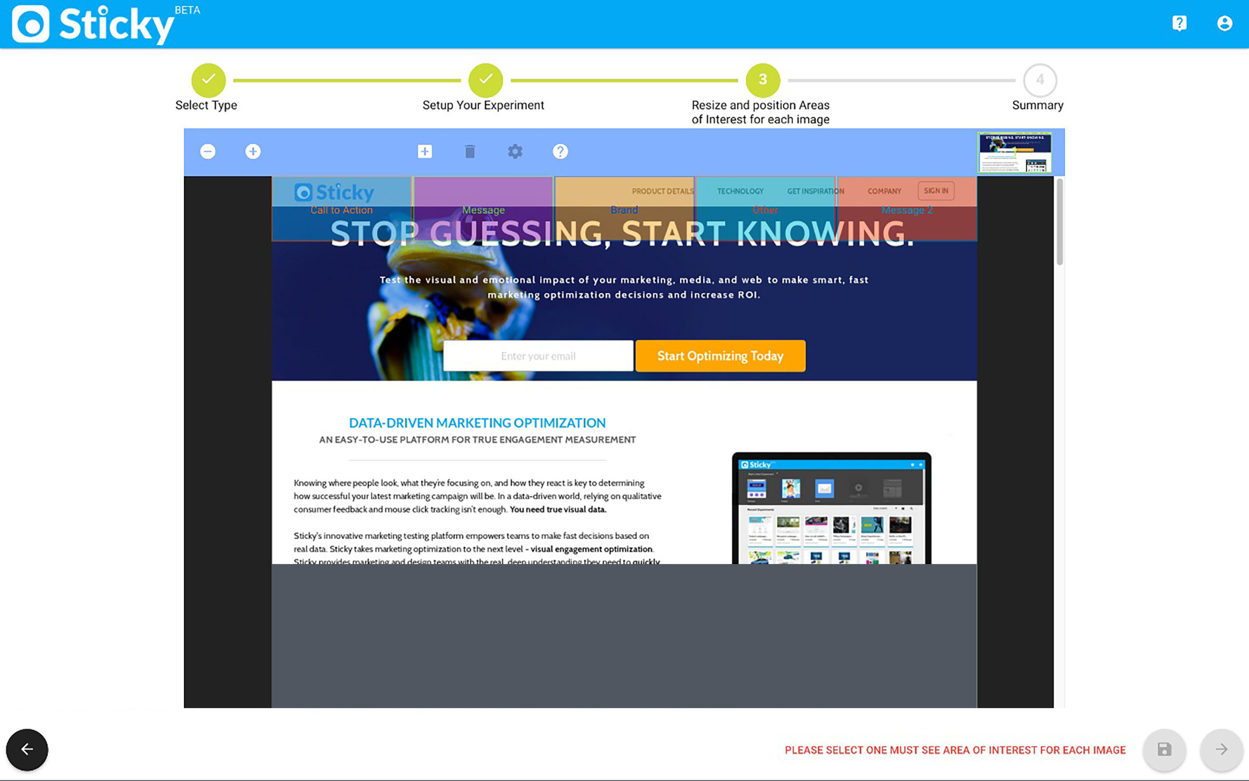
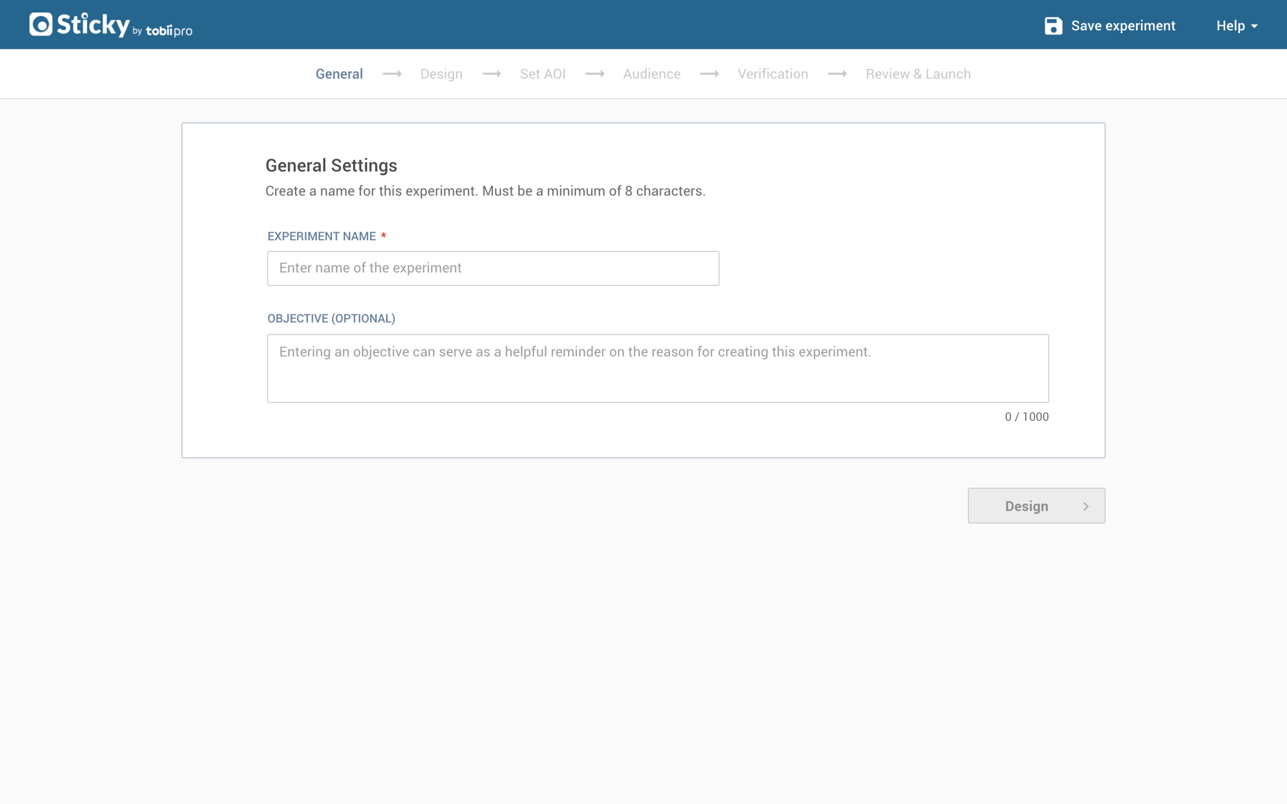
CREATE EXPERIMENT - BEFORE
Content was extremely text heavy and unorganized making it unclear as to what actions the users needed to take.
Navigation proved to be difficult for users who were unable to locate the ‘next’ and ‘launch’ buttons.
Difficult to scale with current components. As the product was evolving, both the clients and we needed flexibility within the UI.
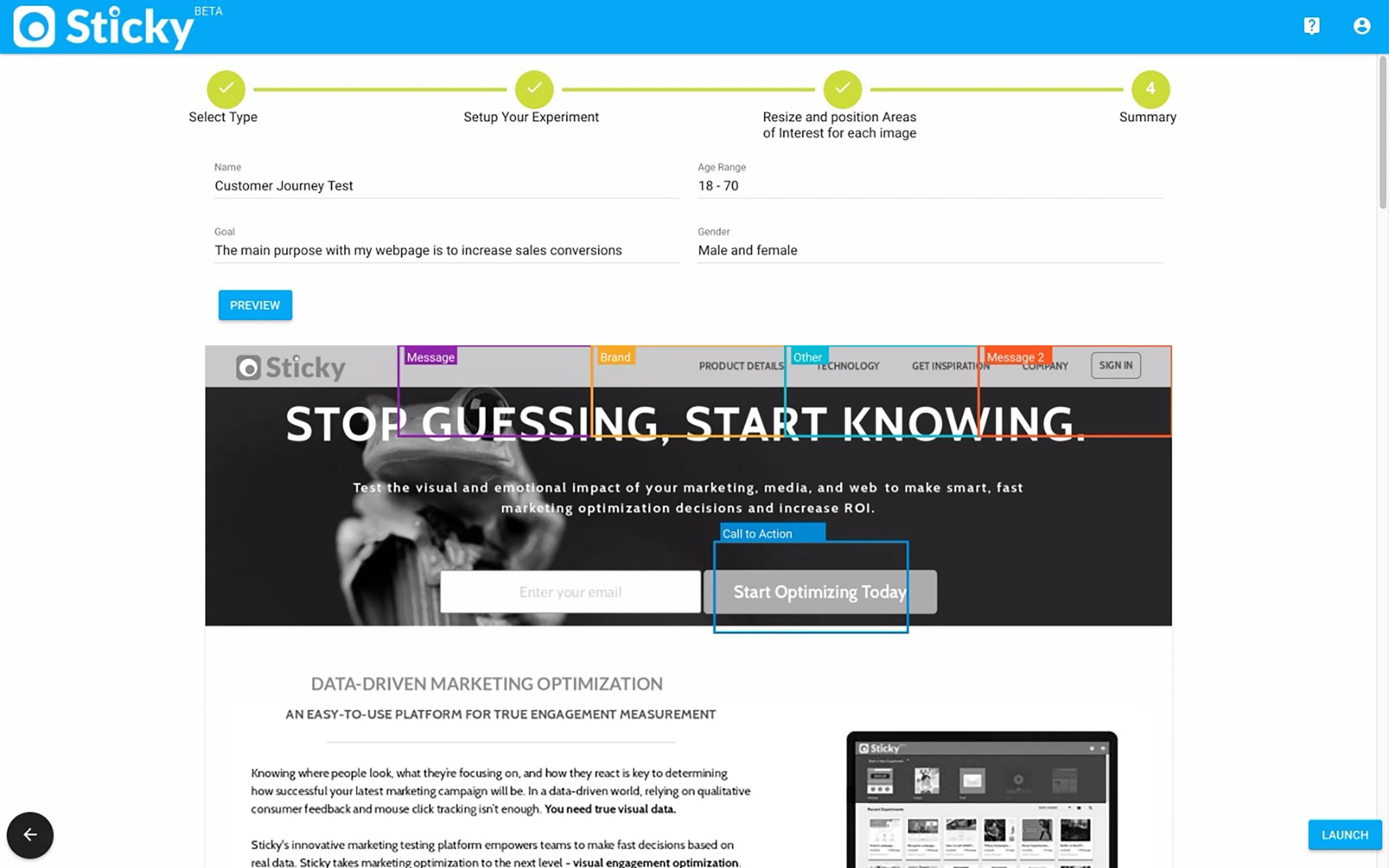
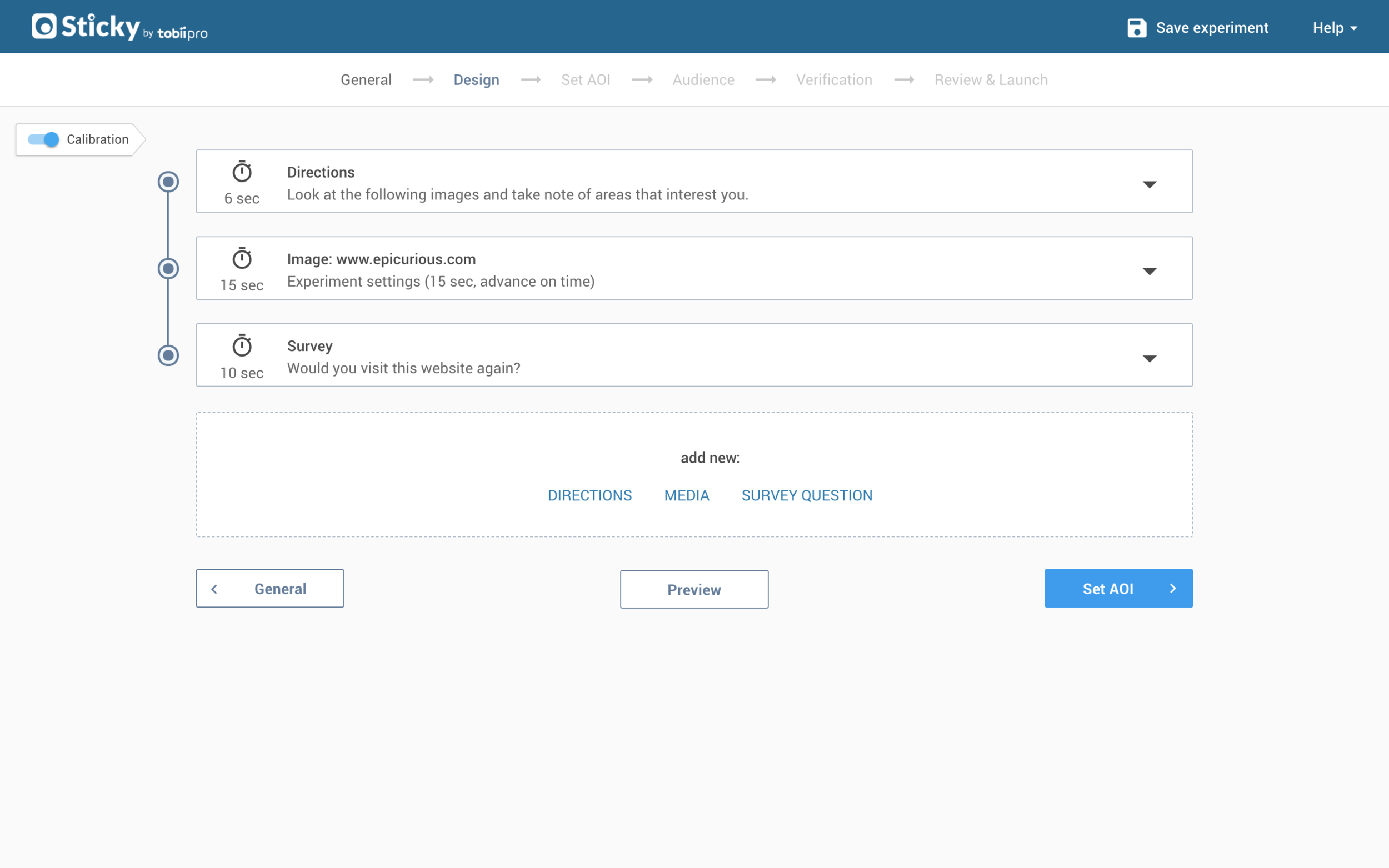
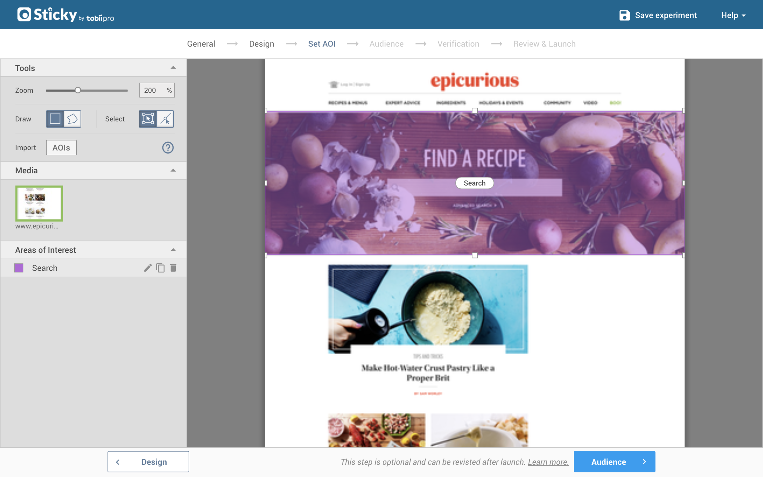
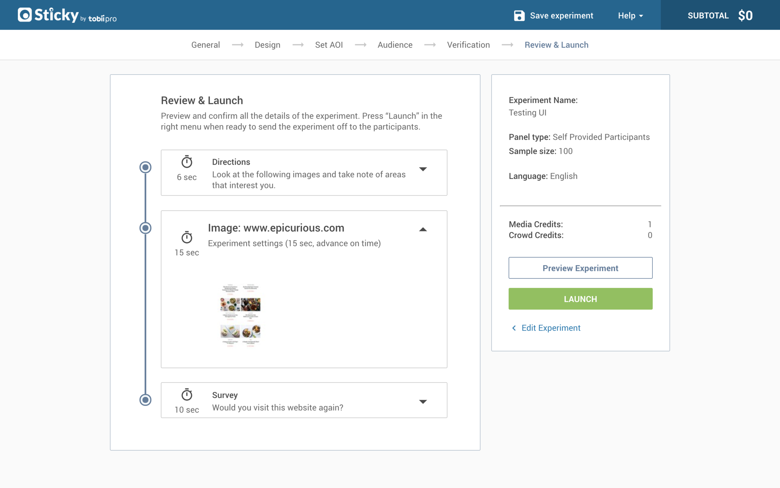
CREATE EXPERIMENT - AFTER
Modular Design allowed us to easily reuse components - and proved to be extremely helpful in regards to the product architecture. Content was interchangeable and consistent.
Designing an Experiment and Setting AOIs had complete facelifts to increase usability. Both were complex projects that need their own case studies!
The Progress Bar ended up with more steps - but was necessary as we added new functionality. The goal was to keep each step short & easy where the user would think, “oh that wasn’t bad all!”
THE OUTCOME
We were proud to release a design that best represented our company and clients.
The final result was a simplified and more intuitive interface designed to relieve pain points for our team and make our clients more successful.
WHAT I LEARNED
Having a strong foundation is essential. Establishing a design system is beneficial for all teams and increases efficiency. Less time is spent trying to figure out small details and setting more time to solve bigger problems.
Sometimes it’s okay to be “good enough”. In the fast pace startup environment, it’s okay to cut corners to save time. For example, even though I wanted to design all our icons I ultimately decided to use Google Material Icons. This enabled me to allot more time user testing and solve bigger problems.